How to prove the ROI of UX to your board


Learn how to prove the ROI of UX to your board: tie UX to retention and sales, pick metrics that matter in B2B, and build the case.
To prove the ROI of UX to your board, show that making your product easier to use moves a number the board already cares about: renewals, sales wins or risk. Pick one business outcome, choose the UX measure that drives it, baseline it, then convert the improvement into the board's language.
It's one of the hardest things for a product leader to prove, and one of the most important. We see it on almost every project: measuring the value of design is underrated, teams have to fight for it, and we rarely get a clear answer when we ask how they currently do it.
That's a problem the moment you need budget. Boards don't fund "a better user experience". They fund retention, sales wins and lower risk. Here's how to make the case for UX in the language they actually use.

What is the ROI of UX?
The ROI of UX is the business return you get from improving how people use your product, compared with what you spent on it. In B2B, it usually shows up as better renewals, more sales wins, lower support effort and time saved for customers.
The maths is the same as for any other investment: ROI = (value gained − cost) ÷ cost. The formula isn't the hard part. Deciding which value to count is, and that starts with the business, not the screens.
Start with the business outcome, not the experience
A better user experience only matters if it changes something the business feels. People can love a product and still use it for free, and no business survives on that. It has to be financially sustainable.
So the starting question is never "is the UX good?". It's "what happens to the business if it's better?". Usually the answer sits in one of three places:
- Renewals. People get more value from the product, so they decide it's worth the investment and stay. Small, overlooked UX details can quietly undermine retention, so this is often where the biggest return sits.
- Sales wins. Prospects see a product that looks credible and is easy to use in a demo, so they believe in it sooner.
- Trust. A dated, clunky platform makes buyers question whether the product is still being looked after. A modern, intuitive one builds confidence before anyone has discussed a single feature. It's one reason applying your brand to the product matters as much as the marketing site.
Pick the one that matters most to your business right now. That's the number your UX work gets tied to.
Why "good UX" is the wrong pitch for your board
Here's the mistake we see most often in the boardroom: leaders talk about user experience, and the board hears "making it look nice". Design gets filed under polish, and polish gets treated as a nice to have.
What you actually care about is workflows and usability: whether people can get value out of the product, easily, to achieve their goal. That's not a soft idea. It's the thing that drives retention.
So say that. "We're making it easier for customers to get their reporting done, which is what keeps them renewing" lands. "We're improving the experience" doesn't. The same applies when you're managing stakeholder expectations around UX/UI design more widely.
If you want a framework for turning design work into a financial case, Nielsen Norman Group's guide to calculating ROI for design projects is a good one. Its core idea is simple: calculating ROI is converting units, turning a UX metric into a business KPI. NN/g's three myths about calculating the ROI of UX makes the other useful point: it doesn't have to be perfectly accurate or all about money. A good-enough estimate beats no estimate.
Stop reporting time on platform as a UX metric
Engagement is the metric most likely to mislead you in B2B.
In a consumer app like Instagram, time on platform is the business model. The longer people stay, the better. B2B is different. If someone logs in at 9am and is still in your tool at 5pm, that might be a success, or it might mean the product is slowing them down.
Most B2B users come for one specific reason. If they can finish in five minutes instead of thirty, they'll be much happier with the platform, even though your "engagement" has dropped. That's why improving user experience in a B2B product often means helping people leave faster, with the job done.
Frequency of use has the same trap. A daily user and a monthly user can both be getting exactly what they need. A manager who comes in once a month for ten minutes to run a report isn't a churn risk. They're a customer who gets value quickly.
We've written more on this in are you tracking vanity metrics or meaningful product signals? The short version: if a metric going up could mean good news or bad news, it isn't telling you much.
The UX ROI metrics that convince a board
Swap engagement for measures of whether people achieve what they came to do, then connect them to money. These are the four we'd start with.
1. Task success and time on task
Can users complete the jobs the product exists for, and how long does it take? These are quantifiable, and unmoderated testing platforms and in-product tools such as VWO make it far easier to collect them at scale than it used to be. Pair them with user experience analytics so you can see where in a flow people stall.
2. Customer sentiment, recorded properly
Verbal feedback from customers is gold, but only if someone captures it. Build a consistent way to record it, so it doesn't vanish when an account manager leaves. There's a simple way to make your user research insights evergreen. Then use in-product prompts to ask about the experience at the moment it matters.
3. Renewal and retention
This is where UX meets the board's language. The 2026 Aleph × Benchmarkit benchmarks, based on full-year 2025 data from 342 SaaS companies, put median net revenue retention at 102%. Seat-based companies sit below break-even, at 98%.
The same report found that expanding an existing customer costs about half as much as winning a new one. Small shifts in retention compound quickly, which is why it's the metric a CFO will listen to.
4. Sales conversion
Do demos convert better? Does the sales team win more when the product is easier to show? Ask them. They'll usually have a view, and a quote from your head of sales carries weight in a board pack.
A worked example: turning minutes into a board number
To turn any of these into a number, use the conversion approach above. Here's an illustrative example. The figures are made up; the method is not.
Say 400 customer users run a core workflow five times a week, and a redesign saves each of them three minutes per run:
- 400 users × 5 runs × 3 minutes = 6,000 minutes, or 100 hours, a week
- 100 hours × 48 working weeks = 4,800 hours handed back to your customers every year
- If that time costs your customers around £40 an hour, that's roughly £192,000 a year in value they get from your product
You can't bank those hours directly. But you can put them in front of a board as the reason renewals get easier, and as evidence for your next price conversation. The maths is simple enough to defend.
Split your UX numbers by user type
Blended averages hide the story. Separate your user types before you report anything.
A daily power user, a weekly analyst and a monthly manager have completely different relationships with the product. What counts as healthy for one looks like a problem for another. It's the same challenge as designing for multiple personas without losing sight of business goals.
When you report by user type, you can show the board where value is landing and where it isn't, instead of one average that describes nobody.
The UX evidence that never shows up in your analytics
This is the honest caveat: you can't always prove the ROI of UX in hard numbers, because some of the best signals don't appear in your analytics at all.
The classic example is the workaround. People who can't quite do what they need inside your platform find their own way round it. Users are hacking your product, and you can learn from it.
A common one is exporting data to Excel so they can manipulate it. On a dashboard, that looks like great engagement: loads of people interacting with the data. In reality, they may be frustrated that they can't do it in the product. You'll only find that out by talking to them.
We saw a vivid version of this during a UX audit for an HR and payroll platform. The audit surfaced some useful changes. But it was only when we spoke to users that we found they were opening two pages of the platform in two separate tabs and placing them side by side, because they needed information from both to complete one task.
No metric would have shown us that. The research did, and it changed how we designed the platform: we enabled that side-by-side use inside the product itself, shaping it around how people actually work. It made a big difference to their experience. You can read more in our HR and payroll software case study.
The lesson for your board case: numbers tell you where to look, and users tell you why. You need both, especially when you're aligning stakeholders and the numbers don't tell the full story.
Interviews, plus watching people complete the tasks they really do day to day, is where the real gold is. Mixing UX research methods gives you both sides. If you're not sure where to start, a UX audit is a good way to combine the two.
How to build your UX ROI case for the board, step by step
- Choose one business outcome. Renewals, sales wins or trust. One, not five.
- Pick the UX measure that moves it. Task success, time on task, or a recorded sentiment score.
- Baseline it before you change anything. You can't prove improvement without a "before". This is where most teams slip, and it's the same discipline as running a good product experiment.
- Segment by user type. Report separately for each group that matters.
- Add the qualitative evidence. Include what users said and what you saw them do. A single workaround story is often more persuasive than a chart.
- Convert it into the board's language. Retention, revenue protected, hours saved, deals won. Not "experience". Test the case on your CFO or head of sales first: it's the same skill as influencing without authority.
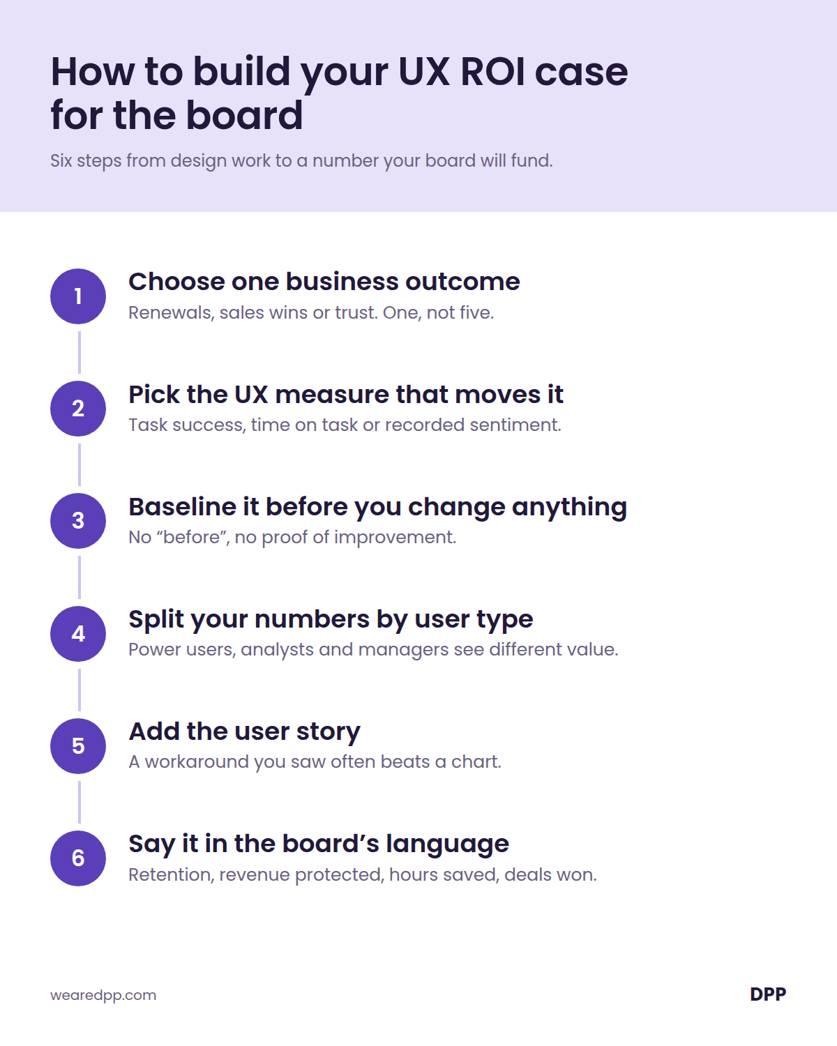
[GRAPHIC 2: the six-step board case. See Images section. Delete this line once the image is added.]
If your team is still working out whether it's measuring outputs or outcomes, our piece on outcome over output is a good companion. If poor UX has been quietly building up cost in the background, the UX debt no one budgets for is worth a read before you go to the board. And if you're not yet sure where the problems are, start with the signs your product needs a UX audit.
What this means for product leaders
- Lead with the business outcome, then show how UX moves it.
- Drop time on platform. In B2B, faster is usually better.
- Use task success, time on task, sentiment, retention and sales conversion as your evidence.
- Baseline first, and report by user type, not as one average.
- Bring a user story to every board pack. It's often the most persuasive slide.
Final thought
Proving the ROI of UX isn't about proving that design is nice. It's about showing that making it easier for people to get value from your product is the most direct route to the outcomes your board already cares about.
Lead with the business result, measure what actually reflects it, and keep talking to your users, because the numbers will only ever tell you part of the story.
Struggling to show your board what UX is actually worth?
We help B2B product teams tie UX/UI design to the outcomes that matter, from renewals to sales wins, and uncover the issues the numbers miss. You can see how in our work.
👉 Book a call with our team to talk about how we can help.
Are you wondering...
The ROI of UX is the business return you get from improving how people use your product, compared with what you spent on it. In B2B, it usually shows up as better renewals, more sales wins, lower support effort and time saved for customers. It's calculated like any other investment return.
Pick one business outcome, such as retention. Choose a UX measure that influences it, like task success or time on task. Baseline it before you change anything, then convert the improvement into a business figure, such as hours saved, revenue protected or deals won. Report it by user type, not as one average.
UX ROI uses the standard formula: value gained minus cost, divided by cost. The hard part is the value. Convert a UX improvement into a business unit, for example minutes saved per task multiplied by users, frequency and weeks, then multiply by an hourly cost or link it to renewal and sales outcomes.
Unlike a consumer app, a B2B tool succeeds when people finish their task quickly. Long sessions can mean the product is slowing users down, and infrequent use can simply mean a user gets value fast. Shorter time to complete a key task is often a better sign of a good user experience.
No. Analytics miss things like workarounds, where users export data to Excel or open extra tabs to get a job done. You only find these by interviewing users and watching them complete real tasks, so the strongest cases combine metrics with qualitative evidence: numbers show where to look, and users show why.
Boards respond to retention, renewal rates, sales conversion and cost or time savings. Frame UX work in those terms, and use task success, time on task and recorded customer sentiment as the supporting evidence behind them. One clear business number with strong evidence beats a dashboard of design metrics.
Avoid "improving the experience", which boards often hear as making it look nice. Say what changes for the customer and what that means for the business, for example "making reporting faster, which supports renewals". Back it with one number and one real user story, such as a workaround you observed.
Show what research changed. Point to a decision it shaped, a problem it uncovered that analytics missed, or a costly build it prevented. A single story, such as users working around the product with side-by-side tabs, often persuades more than a chart, especially when paired with the metric it explains.
You've proved the ROI of UX when the board discusses design in business terms, not as polish. Look for these signals:
✅ You can name the one business outcome your UX work is tied to
✅ You have a baseline and a clear before and after
✅ Your numbers are split by user type
✅ At least one user story sits alongside the metrics in your board pack
✅ The board asks what UX can do next, not what it costs
More insights
.png)
PM, designer or product builder? How AI is reshaping product team roles

Need help delivering at pace whilst maintaining product integrity?
We help B2B product teams rebalance pace and purpose — designing workflows where speed serves strategy instead of undermining it. Book a call to talk about how we can help you deliver your product's vision.