What is a UX audit, and does your B2B product need one?

What is a UX audit, and how is it different from a UX review or heuristic evaluation? A jargon-free guide for B2B product leaders.
Ask for a UX audit and you could get a whole range of things back. A focused expert review of your key workflows. A research programme that puts you in front of your users. A quick, visual teardown of your screens.
All of them are legitimate, and all of them get called a "UX audit". That's why it pays to know what you're asking for before you sign off the budget. So let's get the terminology straight.

What is a UX audit?
A UX audit is an evaluation of how well a digital product's current experience works for the people using it, and for the business behind it. A full audit can draw on several methods, including expert review, analytics, user research and accessibility testing.
In everyday use, though, "UX audit" often means something narrower: an expert review, where experienced designers assess the product against established usability principles. Nielsen Norman Group, the research firm co-founded by usability pioneers Jakob Nielsen and Don Norman, defines an expert review as a UX expert analysing a design to find its usability problems and strengths.
Both are valid. What matters is knowing which one you're buying.
UX audit jargon, decoded
UX audit methods fall into two broad families. Expert-led methods, where specialists inspect the product. And evidence-led methods, where data and users show you what's really happening. Most audits combine a few.
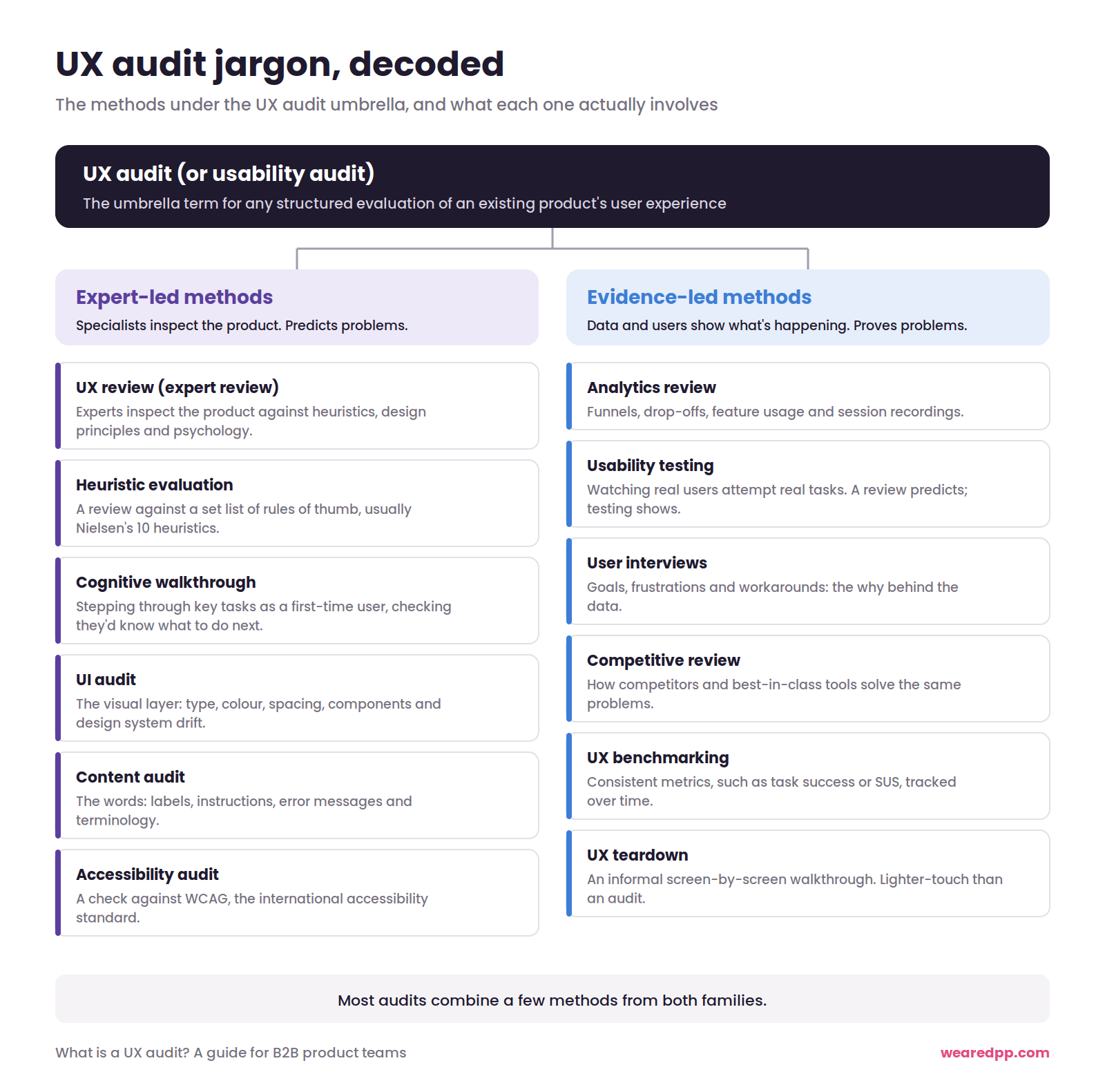
UX audit (or usability audit): the umbrella term for any structured evaluation of an existing product's user experience.
Expert-led methods
UX review (or expert review): experienced practitioners inspect the product against usability heuristics, design principles and psychology, drawing on their own experience.
Heuristic evaluation: a review against a set list of rules of thumb, usually Jakob Nielsen's 10 usability heuristics.
Cognitive walkthrough: evaluators step through key tasks as a first-time user would, asking at each step whether that person would know what to do next.
UI audit: a review of the visual layer, including typography, colour, spacing and components, and how far the product has drifted from its design system. Small details matter more than they look, as we've covered in how small UI details have a big impact.
Content audit: a review of the words in the product: labels, instructions, error messages and terminology.
Accessibility audit: a check against the Web Content Accessibility Guidelines (WCAG), the international standard for making digital products usable by people with disabilities.
Evidence-led methods
Analytics review: using behavioural data, such as funnels, drop-offs, feature usage and session recordings, to see what users actually do. More on this in making design decisions with user experience analytics.
Usability testing: watching real users attempt real tasks. A review predicts where people will struggle. Testing shows it.
User interviews: conversations that uncover goals, frustrations and workarounds. They give you the why behind the data, and often reveal how users are hacking your product to get their job done.
Competitive review: comparing your experience with competitors or best-in-class tools, to see how others solve the same problems.
UX benchmarking: measuring usability with consistent metrics, such as task success rates or the System Usability Scale (SUS), to track progress over time.
UX teardown: an informal, often public, screen-by-screen walkthrough. It's great for spotting patterns, and lighter-touch than a full audit.
The strongest audits mix expert-led and evidence-led methods. We explain how to combine them in mixing up UX design research methods.
The UX audit process: what a UX review looks at
Most of our audits at DPP start as a UX review. We assess the current platform through several lenses, because no single framework catches everything: a heuristic evaluation, established design principles, psychology and accessibility.
Jakob Nielsen's 10 usability heuristics, with B2B examples
Nielsen developed these with Rolf Molich in 1990 and refined them in 1994. They've stayed essentially unchanged ever since, which tells you something. Most examples online are about shopping baskets. Here's what they look like in complex B2B platforms.
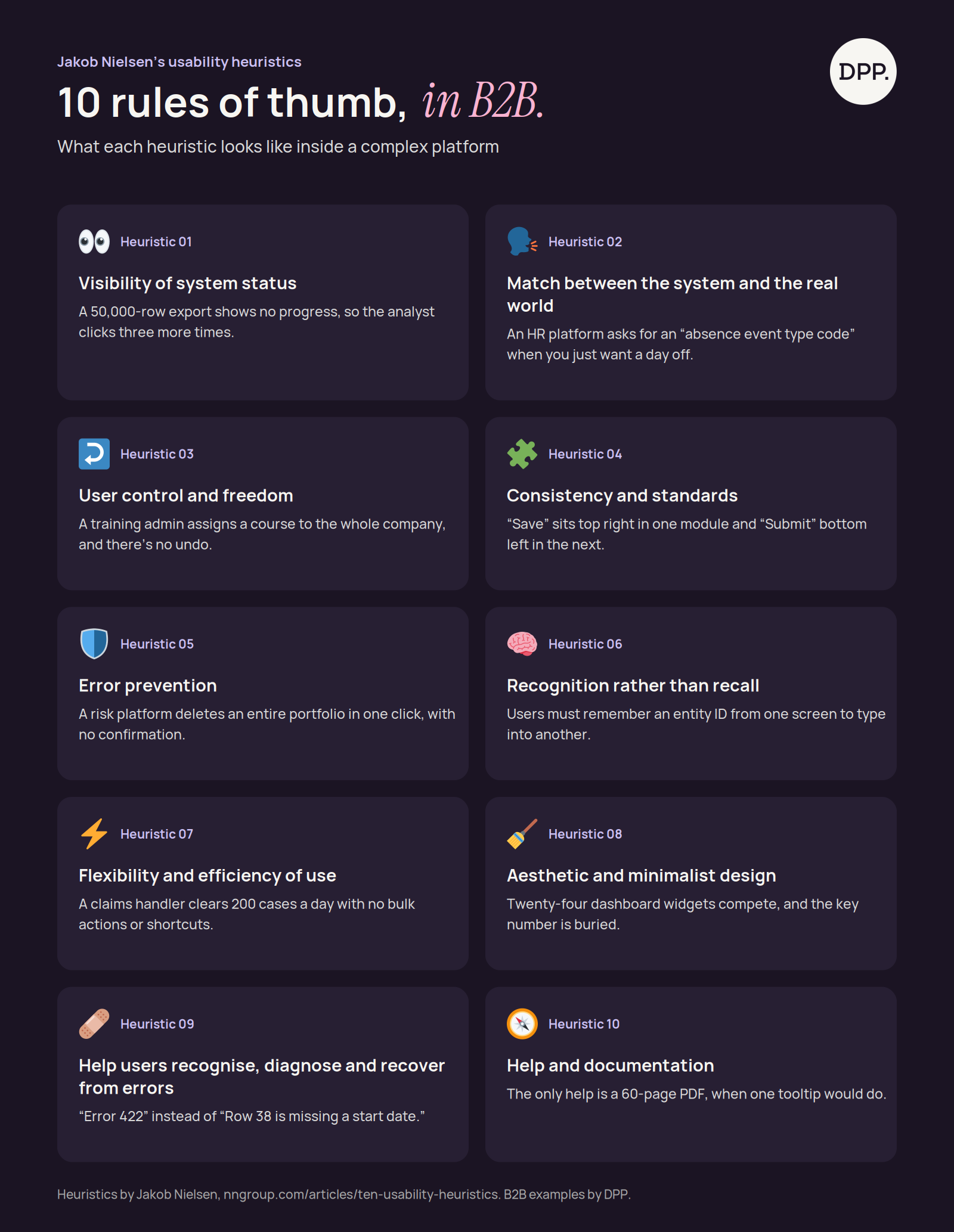
1. Visibility of system status Users should always know what's going on. In B2B: an analyst exports 50,000 rows from a market intelligence platform. Nothing happens on screen, so they click again. And again. Now three identical exports are clogging the queue.
2. Match between the system and the real world Speak your users' language, not your database's. In B2B: an HR platform asks employees for an "absence event type code" when all they want is to book a day's holiday.
3. User control and freedom Give people a clear way out. In B2B: an admin on a workplace training tool assigns a compliance course to the whole company instead of one team. There's no undo, and 4,000 people have just received an email.
4. Consistency and standards The same thing should look and behave the same way everywhere. In B2B: in one module the main button says "Save" and sits top right. In the next, it says "Submit" and sits bottom left. It's a common problem in multi-product SaaS suites, and why consistent product design is about more than looks.
5. Error prevention The best error message is the one you never need to show. In B2B: a risk platform lets someone delete an entire portfolio with one click and no confirmation.
6. Recognition rather than recall Don't make people remember what the interface could show them. In B2B: to build a report, users copy an entity ID from one screen and remember which filter codes they used last time. Good search design for data-heavy products removes most of that memory load.
7. Flexibility and efficiency of use Support beginners and experts at once. In B2B: a claims handler processes 200 cases a day through the same five-step flow, with no bulk actions or keyboard shortcuts.
8. Aesthetic and minimalist design Every extra element competes with the ones that matter. In B2B: the infamous dashboard. Twenty-four widgets shouting at once, and the one number the user logs in for is buried in the corner. This is the hidden cost of complexity in action.
9. Help users recognise, diagnose and recover from errors Say what went wrong, in plain language, and how to fix it. In B2B: an HR manager uploads a spreadsheet of new starters and gets "Error 422: validation failed", when what they needed was "Row 38 is missing a start date." It's one reason form design deserves more attention than it gets.
10. Help and documentation Ideally the product explains itself. When it can't, make help easy to find. In B2B: the only support is a 60-page PDF, when a one-line tooltip would do.
For data-heavy products, NN/g's design guidelines for complex applications are well worth a read.
Beyond the heuristics: design principles and psychology
Heuristics tell you whether a product is usable. Design principles, many rooted in psychology, explain why some interfaces feel effortless and others feel like hard work. Jon Yablonski's Laws of UX collects many of them. These are the ones we see most in B2B platforms.
Hick's law: more choices mean slower decisions. A report builder offering 40 chart types on one screen slows every report down. Recommend the three most useful ones and put the rest a click away.
Fitts's law: big, close targets are easier to hit. A tiny "Approve" button right next to "Reject" is an accident waiting to happen for someone clearing 50 expense claims before lunch.
Jakob's law: people expect your product to work like the ones they already use. If your data table doesn't sort or copy and paste the way Excel does, you're asking analysts to unlearn years of habit.
Law of proximity: things close together look related. Put filters on the opposite side of the screen from the table they control, and users won't connect the two.
Von Restorff effect: the thing that stands out gets noticed. So when everything stands out, nothing does. In a compliance tool where every alert is red, the critical one gets lost.
Progressive disclosure: show what most people need, and tuck the rest away. Most users of a pricing tool need five fields and power users need 30. Show the five, with advanced options one click away. It's the heart of simplifying complex products without dumbing them down.
Peak-end rule: people judge an experience by its most intense moment and its ending. A reporting workflow can run smoothly for an hour. If the export fails at the final step, that's what users remember at renewal.
Persuasion techniques. On your website, trial and upgrade flows, we also look at proven principles of influence, like those set out by psychologist Robert Cialdini. Social proof matters hugely in B2B, and small early commitments during onboarding keep users moving towards adoption. The line is simple: persuasion helps people make good decisions, while dark patterns trick them into bad ones.
The UX audit finding that surprises clients most
It's rarely the complex stuff. The moment that makes product leaders wince is discovering their product fails at the most basic level: colour contrast.
Pale grey text on white. Light blue links that vanish on a light blue panel. It looks sleek in the design file and it's unreadable for a lot of people. They're in good company: the WebAIM Million 2026 report found low-contrast text on 83.9% of the top one million home pages, making it the most common accessibility failure on the web.
The good news is it's one of the easiest fixes you'll ever make, and it makes a huge difference. In the UK, the benchmark to aim for is WCAG 2.2 level AA, which requires a contrast ratio of at least 4.5:1 for normal text.
Contrast is usually just the start. Audits also turn up form fields without labels, workflows that can't be completed with a keyboard, and red, amber and green statuses that rely on colour alone.
Then there's neurodiversity. According to Acas, around one in seven people in the UK are neurodivergent. For some of them, that 24-widget dashboard isn't just busy. It's overwhelming, and it gets in the way of doing their job.
This matters even more in B2B. Your users usually didn't choose your software; their employer did. They can't switch when it's hard to use. They just put up with it until renewal comes round. More on this in our piece on designing for everyone, not just some, and on balancing diverse users with business goals.
Before you commission a UX audit, decide what it's for
An audit is useful for two quite different reasons. Be clear which one you're after, or you'll spend budget answering the wrong question.
1. You want to improve the platform you've got. A UX review is ideal. It gives you a concrete set of changes your team can prioritise and ship, sprint by sprint. It's also the fastest way to start paying down the UX debt no one budgets for.
2. You're planning a major overhaul or redesign. Here, a detailed heuristic review is a waste of time and budget. The platform is going to be redesigned with best practice anyway, so you don't need a list of every inconsistent button in a product you're about to replace.
What's valuable instead is seeing the platform from your users' perspective. What's working that you must protect? What isn't, and why? That means digging into the analytics, speaking to users and watching how they really work. It's much closer to product discovery than a traditional audit, and it's what stops a redesign repeating the old product's mistakes.

Turn UX audit findings into a plan, not a 200-item list
The biggest risk with any audit is ending up with an exhaustive list of everything that's wrong with your product. It adds to your stress rather than helping you move forward.
A useful audit groups its findings. We recommend grouping them by business outcome or user journey, rather than by heuristic or screen.
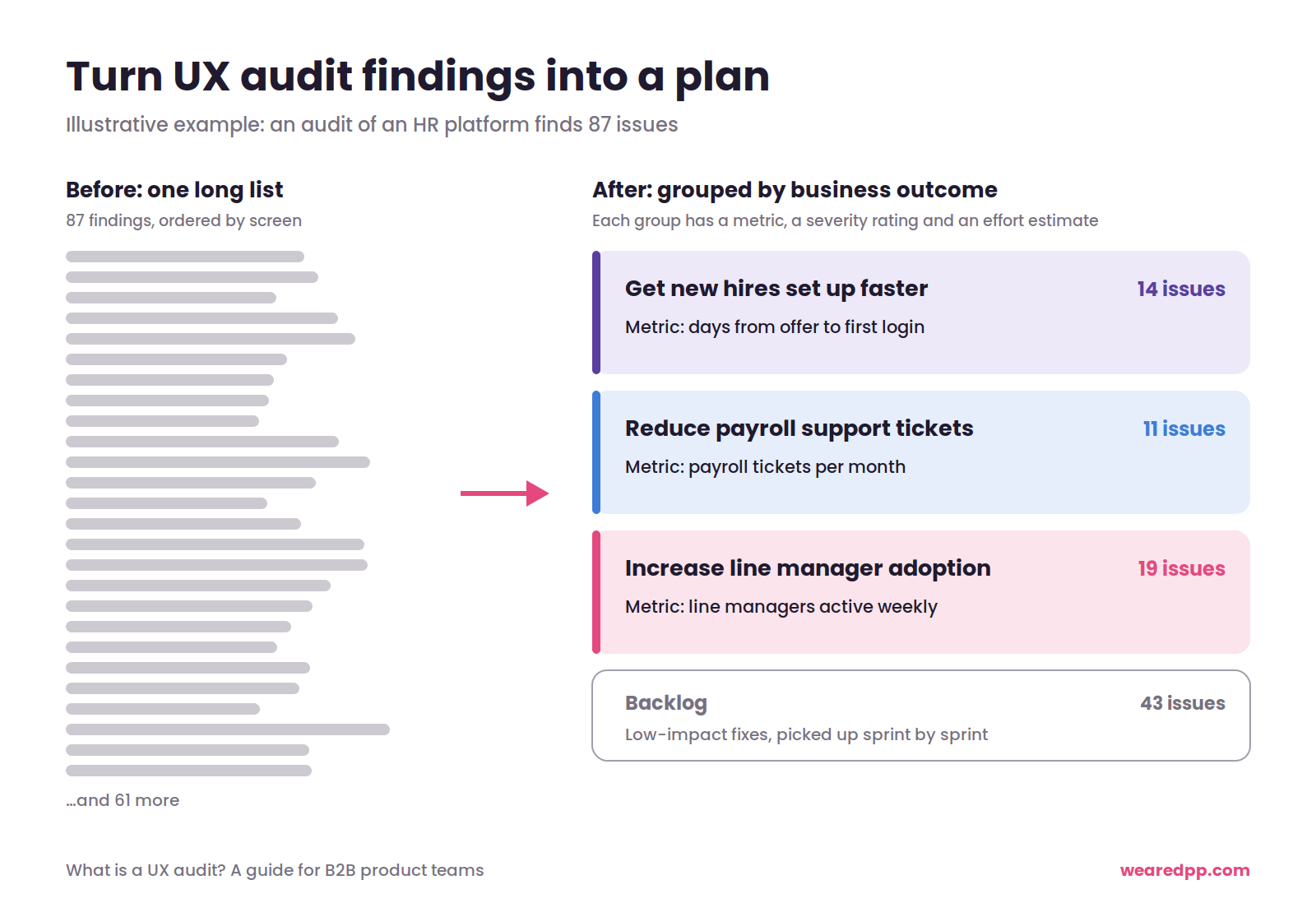
Grouping by business outcome. Say an audit of an HR platform finds 87 issues. Group the ones that matter under outcomes the business cares about:
- get new hires set up faster (14 issues)
- reduce payroll support tickets (11 issues)
- increase line manager adoption (19 issues)
The remaining 43 low-impact fixes go into the backlog. Suddenly it's a conversation your CEO understands, and each group has a clear metric attached. Make sure it's a meaningful product signal, not a vanity metric.
Grouping by user journey. For a market intelligence platform, you might organise findings around the jobs users are trying to do: find a company, build a report, share insights with a client. Your team can then fix a whole journey end to end, rather than tinkering with isolated screens.
Either way, each group should come with a severity rating (how badly and how often the issues affect users), a rough effort estimate and a clear recommendation. That makes it far easier to prioritise under pressure and turn messy findings into product bets.
Does your B2B product need a UX audit?
Probably, if users are working around your product rather than with it, churn is rising and nobody can agree why, or you've got a long list of issues and no idea where to start. We've covered the warning signs in 7 signs your product needs a UX audit.
If the problems are clear but small, you may not need a full audit at all. Our guide on how to improve user experience in a B2B product covers a lighter three-month approach.
What this means for product leaders
- Name the method, not just the label. "UX audit" can mean a two-week expert review or a full research programme. Agree which one before you agree a budget.
- Mix prediction with evidence. Expert reviews predict problems; analytics and usability testing prove them. The best audits use both.
- Don't audit what you're about to replace. Before a redesign, invest in understanding users, not cataloguing old screens.
- Fix the basics first. Colour contrast and form labels are cheap to fix and affect far more users than you'd expect.
- Demand a plan, not a list. Findings grouped by business outcome, with severity and effort, are what get acted on.
Final thought
A UX audit is a tool, not a checklist. It isn't there to prove your product has problems. Every product does.
It's there to give you the lay of the land: what's working, what's getting in users' way and what that's costing the business. Use that to inform your plan, and the UX audit pays for itself. You can see how that plays out in our work with B2B product teams.
Not sure whether your product needs a UX audit, a UX review or something else entirely?
We run UX audits for B2B product teams, turning what's getting in your users' way into a clear, prioritised plan. 👉 Book a call with our team to talk about how we can help.
Are you wondering...
Yes. A UX audit before a redesign shows what to keep, what to fix and what to rethink, so the redesign targets real problems rather than assumptions. Without one, teams often spend heavily on new visuals while the underlying usability issues, such as confusing navigation or broken workflows, carry straight into the new version.
A UX audit is the umbrella term for any structured evaluation of an existing product's experience. It can include analytics, user research and accessibility testing. A UX review, or expert review, is one type of audit, where experienced designers assess the product against usability heuristics, design principles and psychology. In practice, most audits are UX reviews.
A heuristic evaluation is a UX review method in which experts check a product against a recognised set of usability rules of thumb, most commonly Jakob Nielsen's 10 usability heuristics. It's a quick, cost-effective way to find usability problems. It predicts issues rather than proving them, though, so it works best alongside analytics and user research.
Jakob Nielsen's 10 usability heuristics are: visibility of system status; match between the system and the real world; user control and freedom; consistency and standards; error prevention; recognition rather than recall; flexibility and efficiency of use; aesthetic and minimalist design; helping users recognise, diagnose and recover from errors; and help and documentation.
It should. A good UX audit checks key accessibility issues such as colour contrast, form labels, keyboard access and status indicators that rely on colour alone. In the UK, the benchmark is WCAG 2.2 level AA. Low-contrast text is the most common failure on the web, and one of the easiest to fix.
A useful UX audit report groups findings by business outcome or user journey rather than listing every issue. Each group should include the problems found, the evidence, a severity rating, a rough effort estimate and a clear recommendation. It should end with priorities, so your team knows exactly what to tackle first.
More insights
.png)
PM, designer or product builder? How AI is reshaping product team roles
Need help delivering at pace whilst maintaining product integrity?
We help B2B product teams rebalance pace and purpose — designing workflows where speed serves strategy instead of undermining it. Book a call to talk about how we can help you deliver your product's vision.