Applying brand to product: why simplicity wins once users are inside


Your brand gets users in the door. Your product keeps them there.
Your brand gets users in the door. Your product keeps them there.
For SaaS companies, brand is the marketing team’s remit - to create a story that attracts, convinces, and converts. Your marketing website is where the brand needs to work hardest. It needs to sell the promise of what your product can do.
But once users are inside the product, everything changes.
The job of the interface isn’t to impress, it’s to deliver. Users don’t care about your brand’s personality or visual fireworks at this point; they care about getting something done, ideally without having to think too hard about how to do it.
And that’s where SaaS products go wrong. They carry too much of the marketing personality into the product itself - colourful, cluttered, overly expressive - when what users really need is calm clarity. Applying brand to product isn’t about decoration. It’s about how the experience feels when people rely on it every day - a balance between clarity, trust, and brand character that sits at the heart of thoughtful UX design.
If users feel overwhelmed, or don’t know what to do, they leave, and they likely will not come back.
This article explores how to apply brand inside your product in a way that builds trust, strengthens usability, and quietly reinforces your value - all while keeping the focus where it belongs: on the user’s task.
The shift from selling to serving
A marketing website and a product serve two very different purposes.
Your marketing website exists to persuade: to show credibility, build confidence, and convince potential customers that your product will deliver on its promise. This is where you highlight your expertise, feature case studies, and express your brand personality.
Inside the product, the user’s mindset flips. They’re no longer asking, “Should I trust this?” but “Can I get this done?” They’ve already made the decision - or they’re close, using a free demo or trial - and what matters now is the experience of delivery.
That’s why your product design should focus less on you and more on them. Every interface choice should remove friction, support efficiency, and help users feel in control. The best branding inside a product doesn’t compete for attention; it complements the user’s flow.
The shift from selling to serving is subtle but critical. It’s what separates a product that looks impressive from one that feels effortless.

Why restraint is the real brand power
When someone’s using your product, they’re already bought in. They don’t need another reason to believe, they need to get their work done.
That’s why restraint is one of the most powerful forms of brand expression. The most effective product experiences are those that allow the brand to fade into the background, letting usability and simplicity take centre stage.
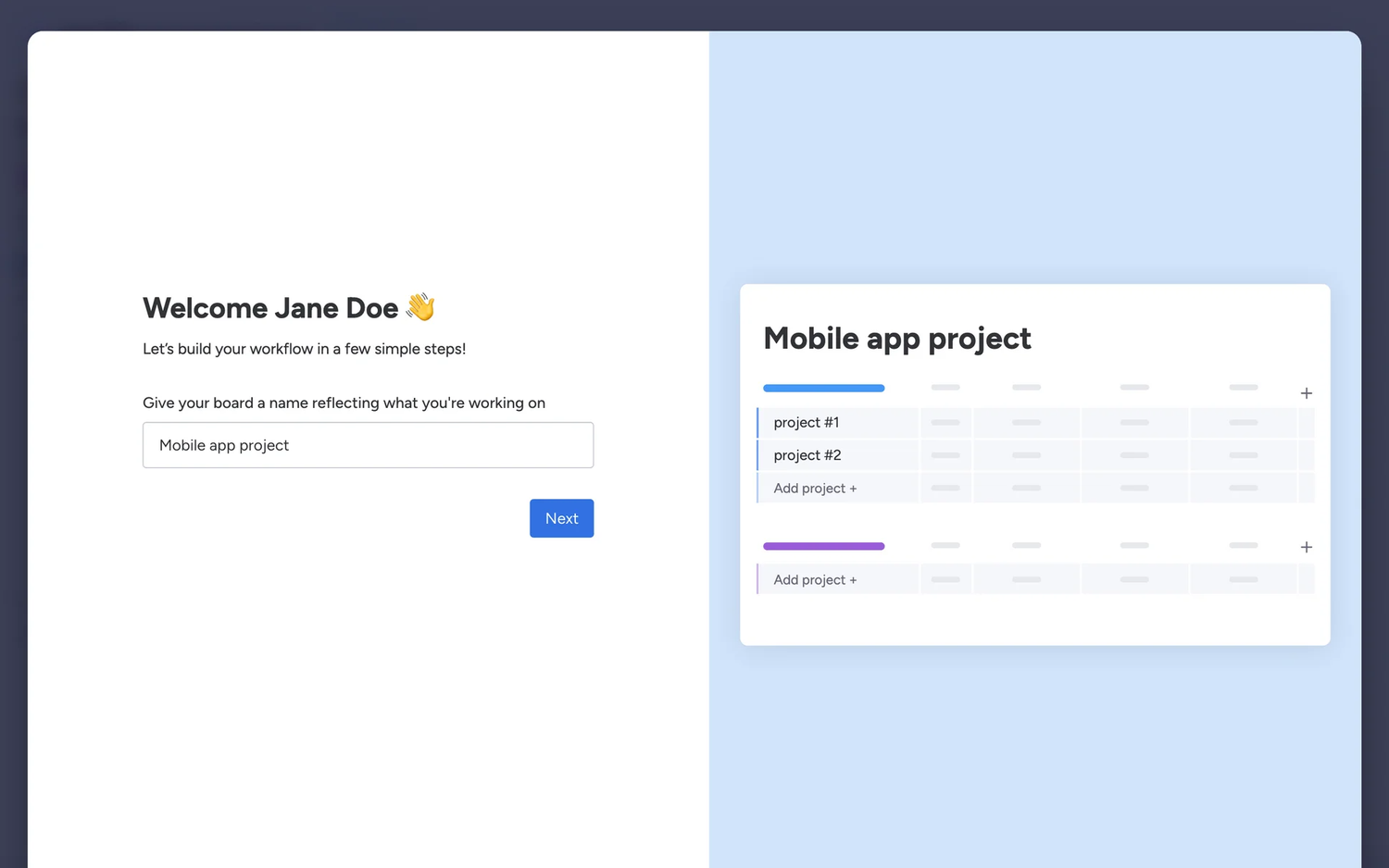
A clean, simple interface is a reflection of confidence. It says, we don’t need to over-design to impress you; we just work. Think about products like Asana or Notion, both are recognisable but never distracting. Their design choices reinforce their brand values (clarity, calm, focus) through layout and interaction, not visual noise.
In contrast, when a product tries too hard to carry its marketing flair into the interface - excessive colours, animations, or quirky copy - it often gets in the user’s way. It’s the equivalent of a salesperson following you around after you’ve already made the purchase.
Research from Nielsen Norman Group supports this, showing that minimalist design reduces cognitive load and improves task success.
Your brand’s maturity shows not in how much personality you inject, but in how confidently you know when to step back.
Subtle brand cues that build loyalty
Of course, minimal doesn’t have to mean sterile. The best brands find ways to show up quietly but memorably.
- Customisation and control
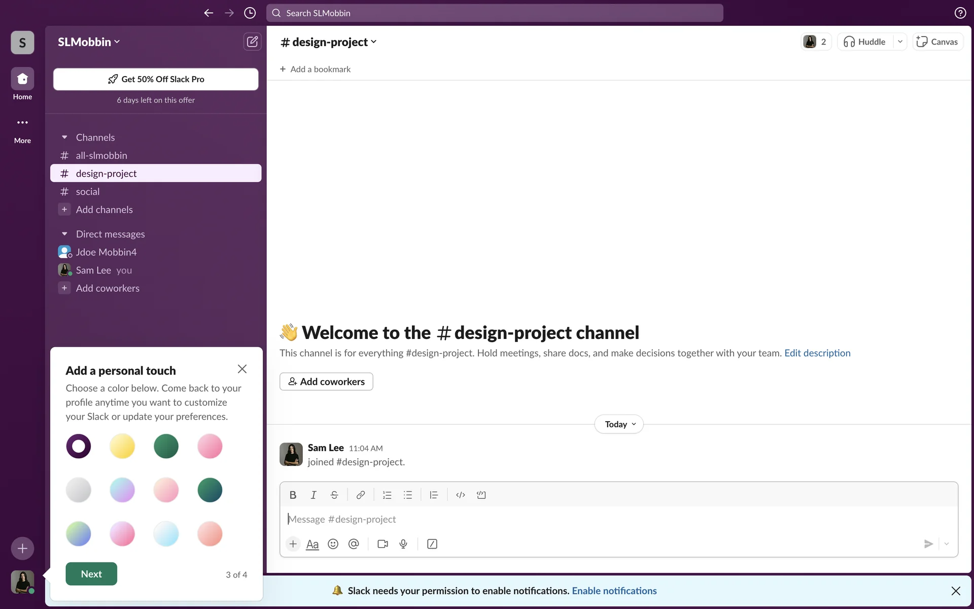
Giving users small ways to make the product feel like theirs - changing layouts, colours, or even toggling between light and dark mode - taps into the endowment effect, a psychological principle that says we value things more when we feel ownership over them. It’s the same reason people love tweaking their Slack themes or setting up Asana boards that suit them. - Delightful micro-interactions
A little confetti after a task completed (Trello), a friendly nudge when you reach a milestone (Pipedrive), or a warm “your card’s on the way” message (Monzo). These tiny moments make people smile and create emotional connection without breaking their flow. - Consistency that builds trust
Visual harmony across your ecosystem - from website to dashboard to emails - builds a sense of reliability. The user doesn’t consciously think “this is on-brand”; they just feel like they’re in familiar territory. That sense of continuity reduces cognitive load and builds loyalty over time.

Monzo

Headspace
The psychology of attachment in product design
Applying brand to product is really about designing for trust and attachment. A few principles worth keeping in mind:
- The Endowment Effect – Users value a product more when they can personalise it or see their identity reflected in it.
- Cognitive Load Theory – The simpler the interface, the more mental energy users can spend on their actual goals.
- The Peak-End Rule – People remember the emotional “highs” and “ends” of an experience; subtle delight at the right moment makes a lasting impression.
Understanding these psychological levers helps design teams apply brand with purpose, not just decoration. The goal is to be memorable in ways that serve the user’s journey.
What this means for product leaders
If you lead product or design at a B2B SaaS company, this comes down to one principle: brand in product should amplify usability, not compete with it.
Here’s how to think about it:
- Treat your marketing site and product as a single journey, but design each to match the user’s mindset.
- Build trust through clarity and control, not through heavy visual branding.
- Use brand to delight and reassure, not to sell.
- Look for moments of emotion in the product experience, and use them intentionally.
A well-applied brand makes users feel confident, competent, and connected. It doesn’t need to remind them who you are; it shows them why they made the right choice.
Wondering how to bring your brand personality into your product?
We love helping teams create experiences that are an extension of your brand, but deliver what your users value most.
Book a call and let’s talk.
Are you wondering...
A: Focus on clarity and consistency first, then use micro-interactions and tone of voice to bring in your brand’s personality during key moments.
A: Brand consistency is important and builds trust. Overuse creates noise. If the branding distracts from completing a task, it’s overuse.
A: They may not consciously notice it, but they feel it. Familiarity, tone, and seamless design build trust and reduce churn over time.
A: Users stick with products that feel intuitive, reliable, and familiar. Therefore a well-applied brand reinforces all three, resulting in trust and retention.
Not fully. Even well-trained models guess when faced with unfamiliar or ambiguous prompts. The real solution is to design around uncertainty, with visible context, validation steps, and feedback loops.
More insights

How AI is changing the balance between short-term decisions and long-term product strategy

AI is accelerating product development - but without design, it’s accelerating risk

When outsourcing product design is the right move for your business
Need help delivering at pace whilst maintaining product integrity?
We help B2B product teams rebalance pace and purpose — designing workflows where speed serves strategy instead of undermining it. Book a call to talk about how we can help you deliver your product's vision.