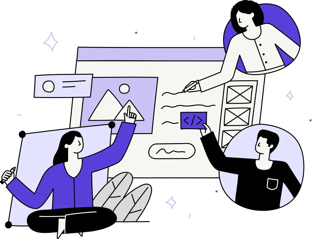
The reality of maintaining that experience, especially as your footprint expands, is anything but straightforward.
In theory, product suites promise synergy. It's a connected ecosystem that delivers more value together than any single tool on its own. But the reality of maintaining that experience, especially as your footprint expands, is anything but straightforward.
With multiple tools under one brand, misalignment creeps in fast. Teams work in silos. Patterns evolve in parallel. Components get reused inconsistently. Suddenly, what was meant to feel seamless now feels stitched together. The result? Users have to relearn the basics with every new tool they touch.
If you’re overseeing a suite, you're managing features and your users' overall experiences. One that spans products, teams, and user expectations. And in SaaS product design, that requires more than shared stylesheets. It takes coordination, clarity, and a long-term approach to cohesion.
The UX problems most product suites run into
Even the most successful product suites struggle with consistency. The challenges can seem minor on their own, but together, they create real friction for users and real risk for teams. Here’s where things typically start to break down:
Familiar faces, different personalities
Most B2B suites start with a hero product. Over time, new tools are added through acquisitions, internal development, or spin-offs. Suddenly, you’re managing a constellation of tools that look, feel, and behave differently.
Even small differences can create friction:
- Buttons placed in slightly different locations
- Navigation that breaks expectations
- Inconsistent terminology across modules
From a distance, the product suite might look coherent. But to users, these differences add up. What should feel like a seamless experience ends up feeling stitched together.
And that directly impacts adoption, satisfaction, and retention. Especially in enterprise UX design, where users spend hours navigating across multiple tools.
Disconnected teams, disconnected experiences
Behind every UX inconsistency is often a structural issue. When each product is owned by a separate team, each with its own backlog, goals, and ways of working, alignment takes a back seat.
This makes it difficult to:
- Apply a unified design system
- Maintain shared components over time
- Coordinate product updates across modules
Instead of scaling design intentionally, each team adapts components to meet their own needs, leading to divergence over time.
That’s why companies with a strong multi-product UX strategy often create a centralised design council. Not to override product teams, but to guide and support them with tools, patterns, and principles that work across the suite.

Why good UX patterns aren’t always portable
Even with shared components in place, applying them across products isn’t always plug-and-play.
A pattern that works well in one context might break in another. That’s especially true in SaaS product design, where tools serve different use cases, industries, and user roles.
Designers often find themselves asking:
- How do we preserve the distinct value of each tool without splintering the experience?
- Where should we unify interactions, and where should we diverge?
- What’s the right balance between consistency and contextual relevance?
These aren’t easy calls to make. And there’s no single right answer. But without a strong UX foundation and ongoing collaboration, decisions become reactive, not strategic.
What makes this hard to fix
Many teams underestimate how much effort it takes to truly unify a product suite. It’s not just a design exercise. It touches engineering, product, marketing, and customer support.
Some of the common blockers include:
- Technical debt: Older codebases make implementing new design systems painful
- Cultural resistance: Teams are protective of their existing UX
- Speed over alignment: Feature delivery takes precedence over experience cohesion
It’s also hard to measure. While individual product metrics might look fine, the cracks appear in the cross-product journeys. Especially when users drop off while moving between tools.
A well-executed SaaS design strategy considers these realities. It scopes changes in phases, gets stakeholder buy-in early, and builds in time for user feedback.
So, what does good look like?
Getting a product suite to feel unified starts with the basics, but goes well beyond them. From a UI standpoint, it's often tempting to align the obvious: navigation bars, colour palettes, typography, and button styles.
These visual elements do matter:
- Familiar UI structures reduce cognitive load
- Shared colour palettes create brand continuity
- Aligned typography and spacing foster polish
But surface-level harmony isn’t enough. The strongest SaaS product design strategies understand that unification also means deciding where to preserve distinctiveness.
Teams like Envato and Zurb have taken this route, using shared patterns and components while allowing product-specific visual theming. This strikes a balance between a cohesive system and recognisable differentiation.
How you roll out change also matters. Large-scale redesigns can feel abrupt, especially in enterprise settings. Some teams opt for:
- Rolling updates, prioritising the highest-traffic views
- Beta access to new designs with feedback prompts
- Clear communications before and after changes go live
This not only softens the impact of change but also builds loyalty among users who feel included. With ongoing input and gradual transitions, unification becomes a process; one that evolves with the product and the people using it.
In unified product suites, users should be able to move between tools without having to relearn the interface. That means:
- Shared UI patterns across all modules
- A consistent navigation structure
- Harmonised onboarding flows
- Unified account and permission management

But it’s not about flattening every tool into the same design. The best suites preserve product personality without sacrificing usability.
Consistency is a signal of trust. When UX is scattered, users assume the organisation behind it is, too. And for buyers making enterprise-level decisions, that signal matters.
Making it real: where to start
Unifying a product suite doesn’t have to mean a top-down overhaul. Some of the most impactful moves are small and systematic:
- Start with the basics: headers, typography, spacing, and iconography
- Document UX inconsistencies and prioritise the highest-friction areas
- Run a collaborative audit across teams to build shared awareness
- Establish a lightweight design system that evolves with usage
In SaaS product design, progress looks less like a rebrand and more like slow, deliberate harmonisation. Done well, it compounds, building trust, reducing friction, and making your entire suite more competitive.
Designing a single product is hard enough. Designing a suite that feels like one product rather than several stitched together? Even harder.
Over time, UX inconsistencies add up. What starts as small design or terminology mismatches between tools quickly turns into user confusion, reduced trust, and missed opportunities.
Especially for enterprise buyers who expect cohesion across the entire experience.
Grand redesigns won't save your product suite's UX. But creating a shared commitment across teams, backed by clear principles and consistent patterns, will.
Steady, deliberate progress trumps anything else.
Need a second opinion on your product suite’s UX?
We work with product leaders to untangle experience gaps, align design systems, and build consistency across complex SaaS portfolios. Let’s make something great together.
We help B2B teams build product experiences that drive real growth without guesswork. If you're exploring PLG or refining your strategy, get in touch for a chat.
More insights
How AI is changing the balance between short-term decisions and long-term product strategy

AI is accelerating product development - but without design, it’s accelerating risk
When outsourcing product design is the right move for your business
Need help delivering at pace whilst maintaining product integrity?
We help B2B product teams rebalance pace and purpose — designing workflows where speed serves strategy instead of undermining it. Book a call to talk about how we can help you deliver your product's vision.