How to simplify complex products without dumbing them down

The truth is, simplicity isn’t about removing complexity. It’s about structuring it intelligently.
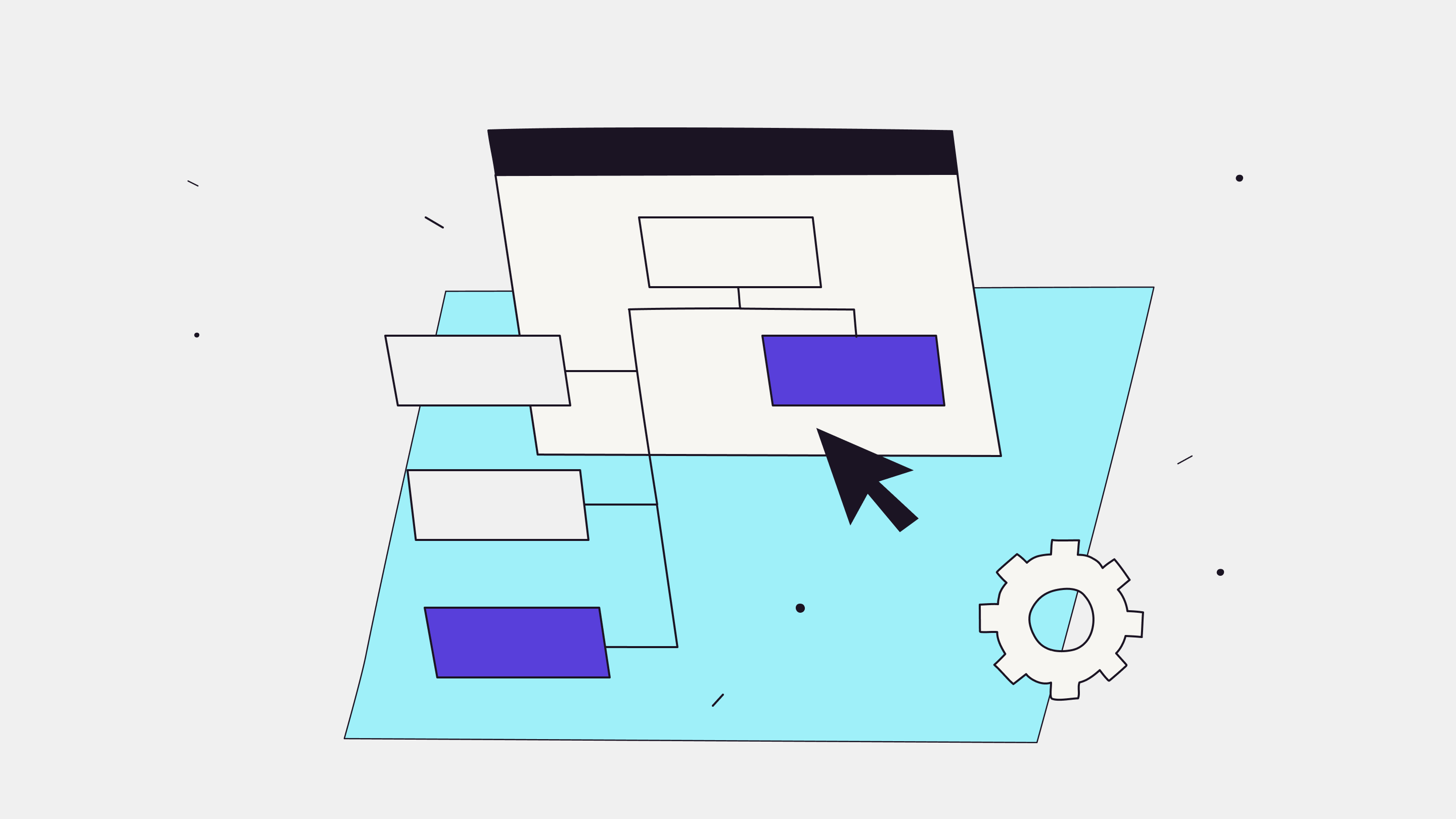
UX for complex systems
Simplicity is a word that gets thrown around a lot in product design, especially in B2B.
Everyone wants “simple”. But when teams try to simplify complex products - whether you’re building risk modelling software, data analytics platforms, or market intelligence systems - simple often gets confused with stripped-back.
The truth is, simplicity isn’t about removing complexity. It’s about structuring it intelligently.
When users say something feels “simple”, what they really mean is it feels clear. They’re not overwhelmed. They know where to start. They can get what they need quickly. And that’s what good User Experience (UX) does, it creates clarity, not reduction.
Why complex products feel overwhelming
There’s a common trap we see product teams fall into: They obsess over the dashboard.
The thinking goes: “Let’s put everything important on one screen so users can access it instantly.” It sounds logical until your users log in and freeze because they don’t know where to begin.
Dashboards are often designed for completeness, not flow. Every chart and metric is competing for attention. And while it might look impressive in a sales demo, it can feel chaotic in day-to-day use.
This is where information hierarchy becomes critical. When everything looks equally important, nothing feels clear.
Complexity itself isn’t the problem, disorganisation is.
Simplifying without stripping power
The real skill in designing for complexity is knowing what to surface, when to surface it, and how to help users feel in control. Knowing what’s important to users starts with solid user research.
Here are a few principles we use when working with complex products:
1. Use progressive disclosure
Show the essentials first through progressive disclosure, reveal depth as users need it. Let people expand, drill down, or customise. Don’t drown them in options straight away.
2. Create clear hierarchy
Give the eye somewhere to land. Primary actions should be obvious, secondary ones discoverable. Size, contrast and spacing aren’t decoration, they’re guidance.
3. Reveal tools in context
Show features when and where they’re needed. Power tools are great, but not if they’re sitting in a global nav waiting for someone to stumble across them.
4. Give users flexibility
Advanced users don’t want restrictions. Let them export data, filter deeply, or build custom views. Flexibility = ownership.
5. Declutter with purpose
Clean design doesn’t mean empty design. It means removing friction, not functionality. And you can still bring through your brand personality.
The psychology behind clarity
When users feel overwhelmed, it’s not just because there’s too much on the screen, it’s because they don’t know where to focus.
Good UX reduces cognitive load by helping the brain make fast, confident decisions. It does this through hierarchy, spacing, and rhythm, giving users visual cues about what matters most.
There’s also a psychological safety element at play: people trust systems that feel predictable and under their control. When you design products that let users progress naturally - without surprise or confusion - they feel capable.
Capable users become loyal users.
Clarity is emotional as much as it is visual.
UX for power users
Some products are built for people who like complexity - risk analysts, data modellers, engineers. For them, a “simple” interface can feel condescending.
The goal here isn’t to simplify the capability, it’s to simplify navigation. Power users want depth, but they also want efficiency.
- Give them shortcuts and automation for repetitive actions.
- Let them tailor the interface (filters, views, modes).
- Keep advanced options available - just not in the way.
- Reward mastery with speed, not noise.
Think of tools like Figma, they look approachable on the surface, but they’re packed with depth. They scale with you as you get better. That’s the sweet spot for B2B products: design that lets users flex the product to their needs, without losing clarity or control.
Complex products just shouldn’t feel complicated
Simplifying complex products isn’t about hiding the detail, it’s about helping people handle it. Clarity gives users confidence. And confidence turns into trust, loyalty, and adoption.
When you design for understanding, users don’t feel overwhelmed by what your product can do, they feel empowered by it.
That’s the difference between software that’s powerful and software that’s a pleasure to use.
Wondering how to simplify your complex product?
We help teams bring order to complexity - designing experiences that feel effortless to use, even when what’s happening behind the scenes is anything but simple.
Book a call and let’s talk.
Are you wondering...
A: Focus on clarity and consistency first, then use micro-interactions and tone of voice to bring in your brand’s personality during key moments.
A: Brand consistency is important and builds trust. Overuse creates noise. If the branding distracts from completing a task, it’s overuse.
A: They may not consciously notice it, but they feel it. Familiarity, tone, and seamless design build trust and reduce churn over time.
A: Users stick with products that feel intuitive, reliable, and familiar. Therefore a well-applied brand reinforces all three, resulting in trust and retention.
More insights

How AI is changing the balance between short-term decisions and long-term product strategy

AI is accelerating product development - but without design, it’s accelerating risk

When outsourcing product design is the right move for your business
Need help delivering at pace whilst maintaining product integrity?
We help B2B product teams rebalance pace and purpose — designing workflows where speed serves strategy instead of undermining it. Book a call to talk about how we can help you deliver your product's vision.